Increasing engagement with a sex positive social audio platform
Project scope
Design a feature that allows users to post audio memos, which also allows for audio comments and replies, for MŌN’s next role out. Also address where this feature will live, how it will be interacted with.
Methods
User and client interviews
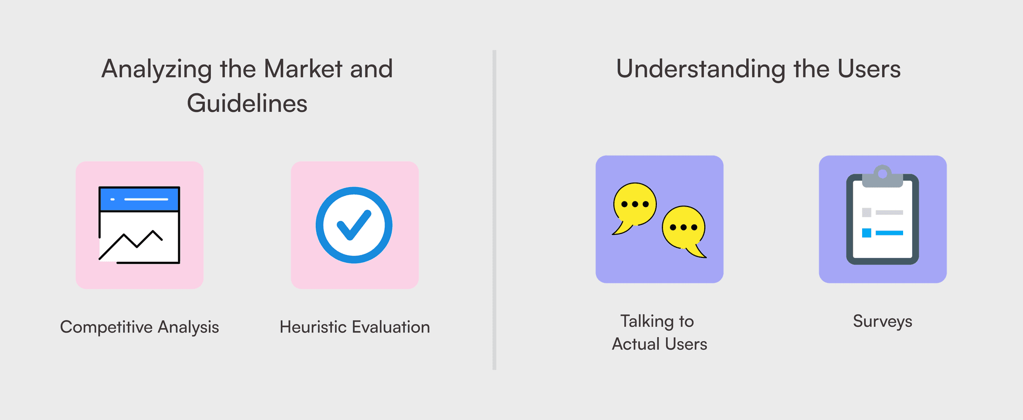
Surveys
Competitive analysis
Heuristic evaluation
Affinity & journey maps
Prototyping
A/B Testing
My role
Personally responsible for leading interaction design and usability testing.
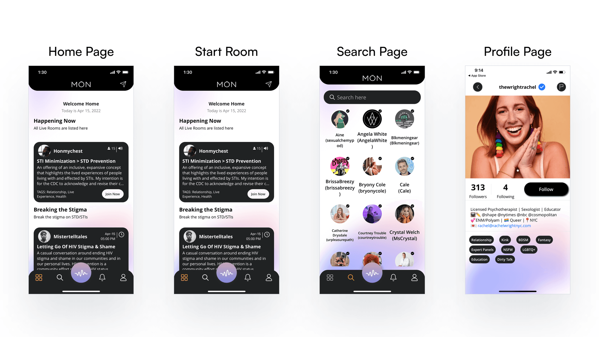
Mōn at the beginning of project
Research methodologies
The team gained limited access to the MŌN’s user base due to the nature of this app. Despite being very public with their sex lives, users are understandably shy and concerned about privacy. To help us work around this, MŌN’s CEO offered us a solution that capitalized on his established report with the community.
MŌN’S CEO promoted and hosted a live room which acted as a group interview. He(Cale) even invited several of his featured users, who we identified as sex positive content creators. The turnout was a large room by MŌN standards, about twenty users. Our research team attended, provided MŌN’s CEO with a list of questions, and fed additional follow-up questions in real time. Our notes from this group interview yielded a substantial amount of data.
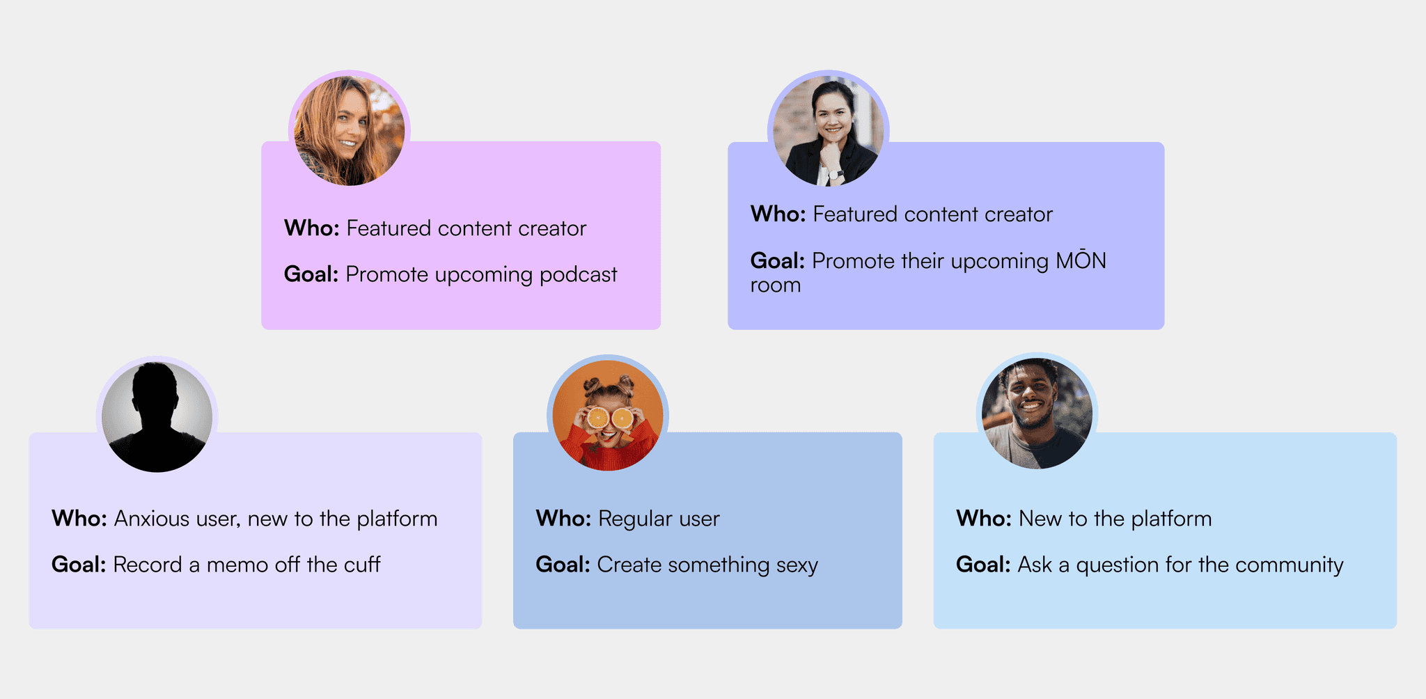
User personas
Additionally, we sent out four short-answer surveys which targeted the follow segments:
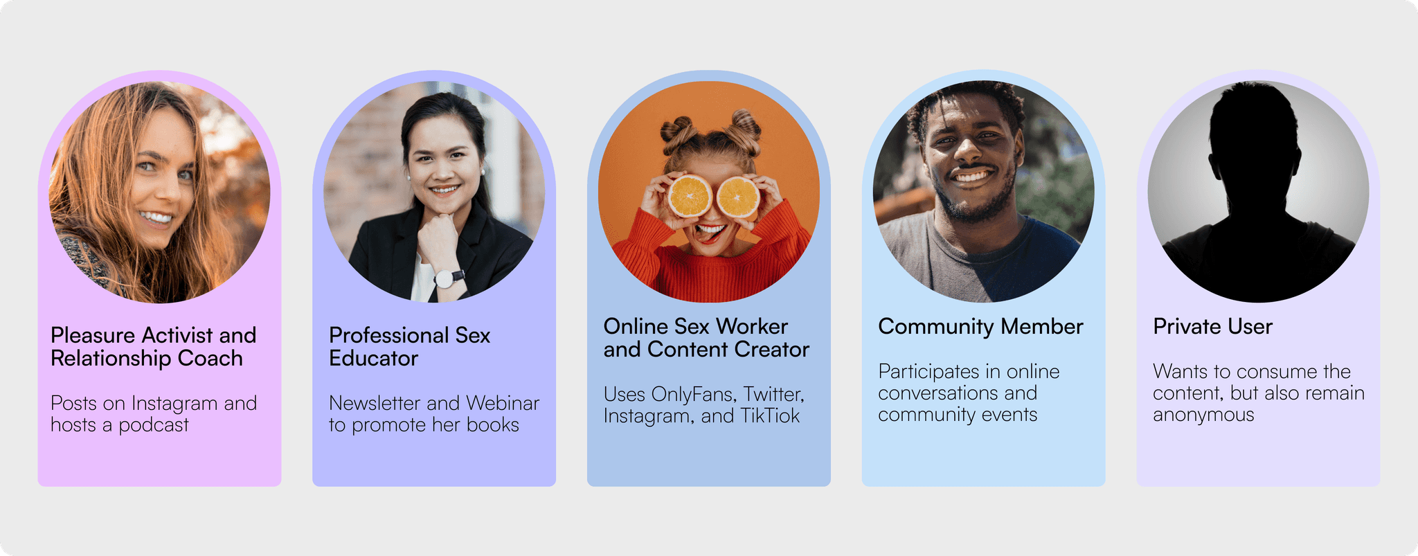
Sex positive content creators on MŌN (featured users)
Sex positive content creators NOT on MŌN
Sex positive content consumes on MŌN
Sex positive content consumers NOT on MŌN
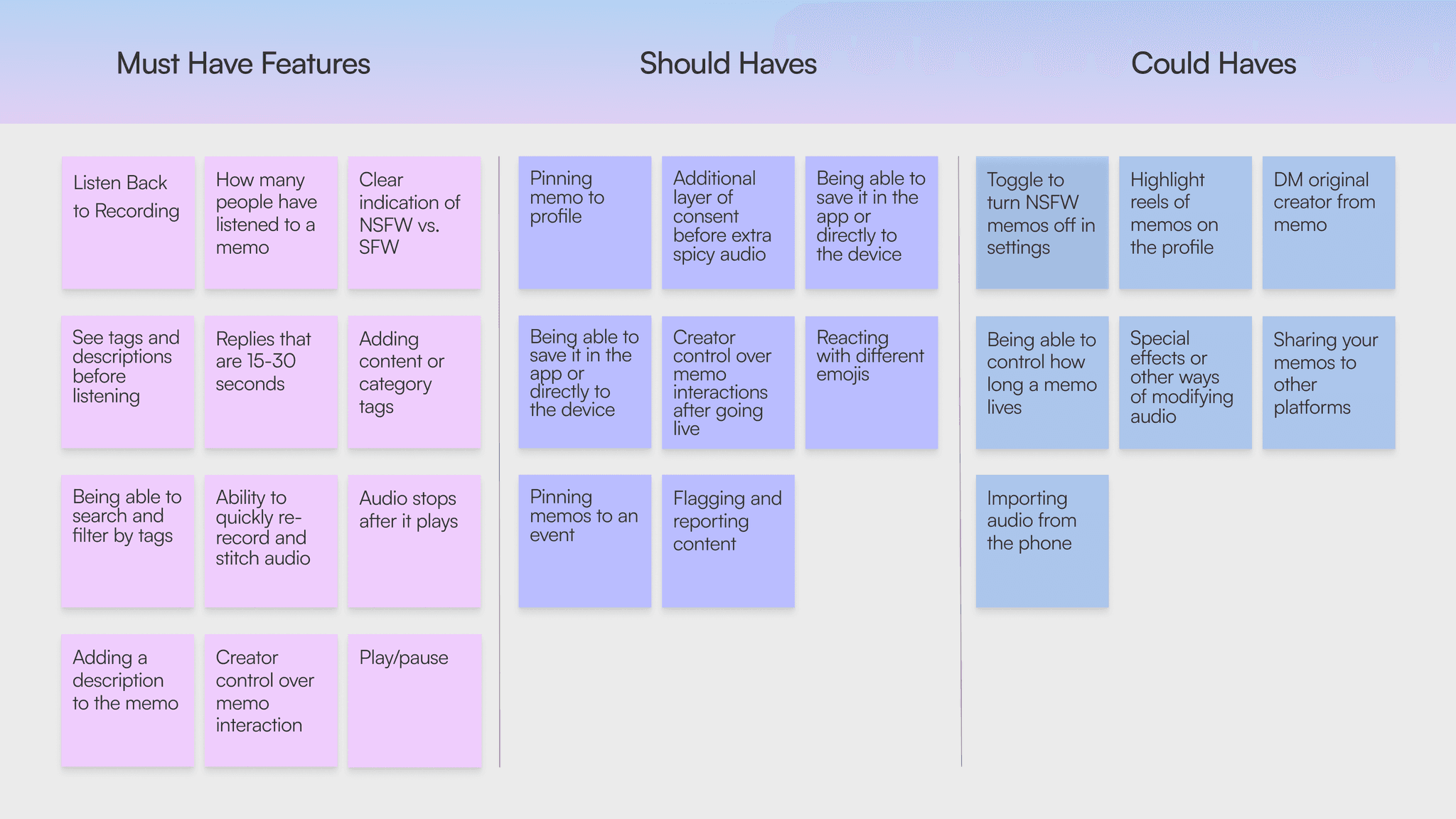
General user wants
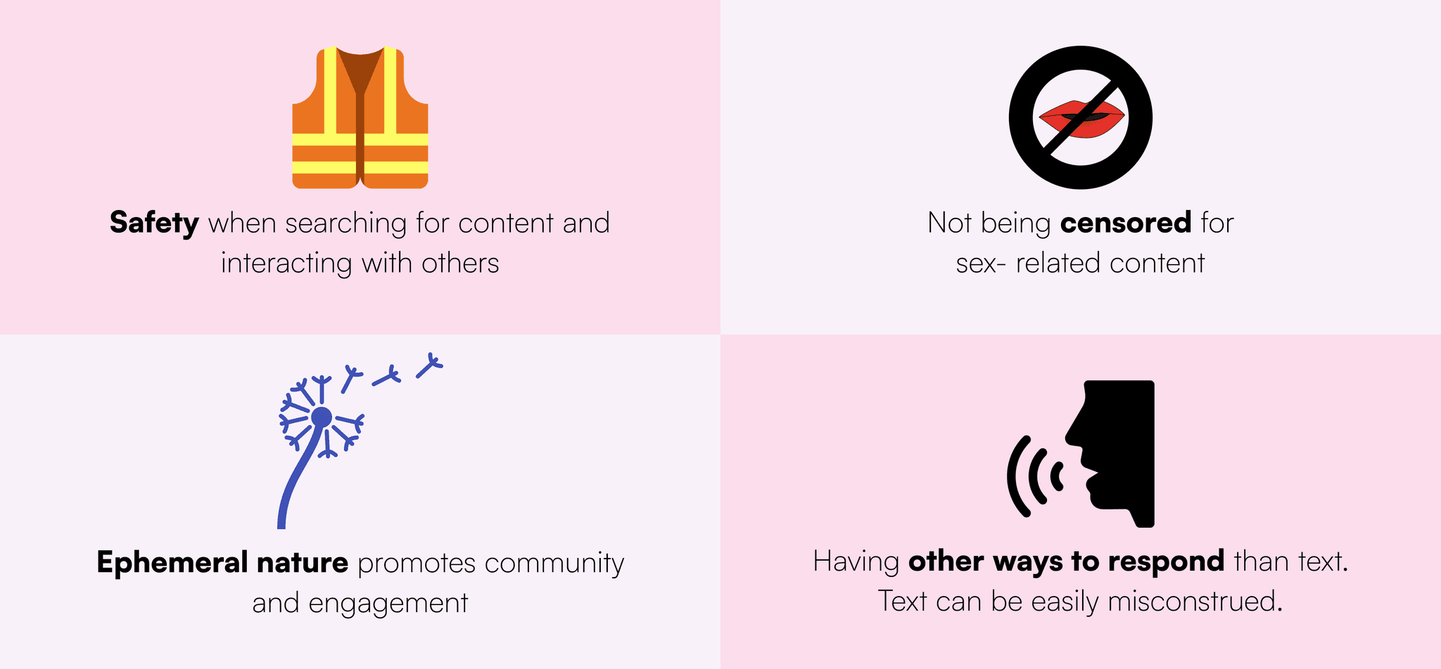
Potential memo creator wants
Potential memo consumer wants
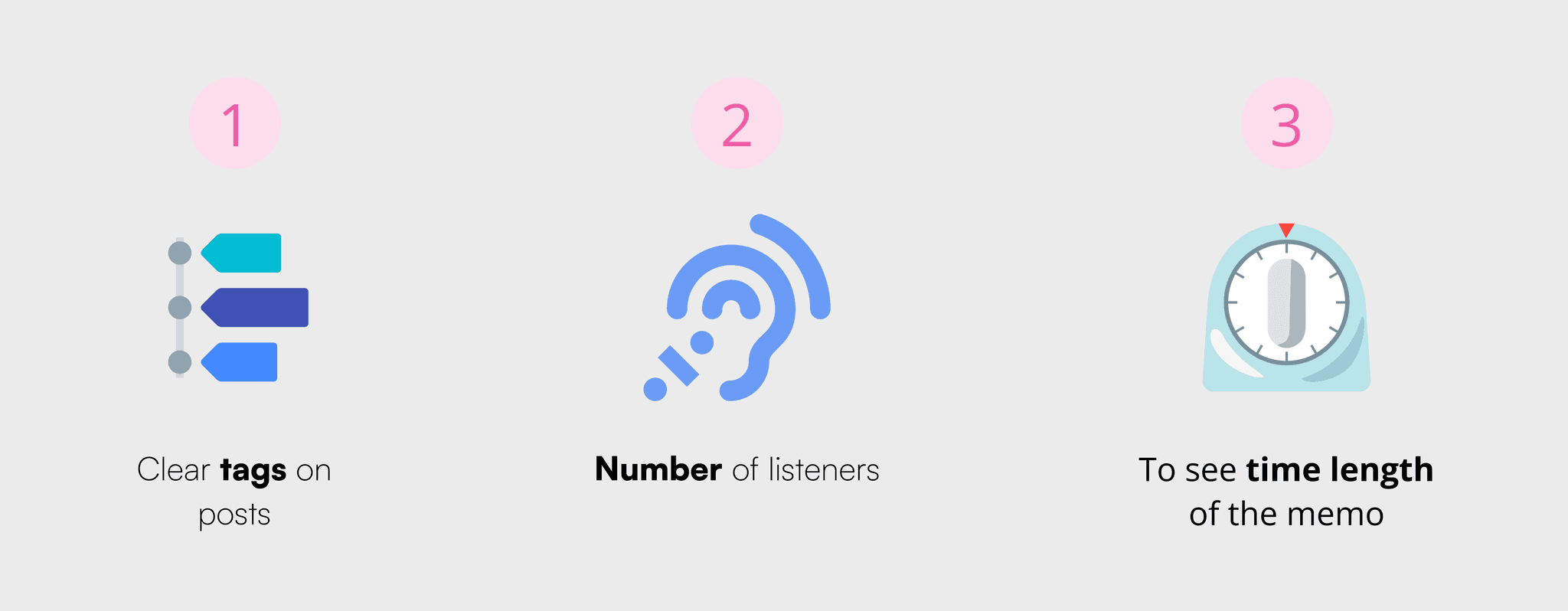
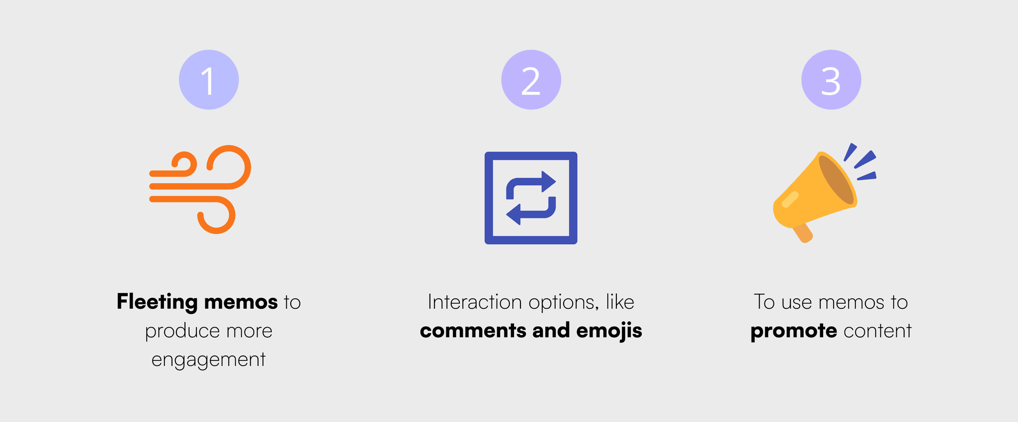
How some users would use memo's
Potential features
Ideation and wireframes
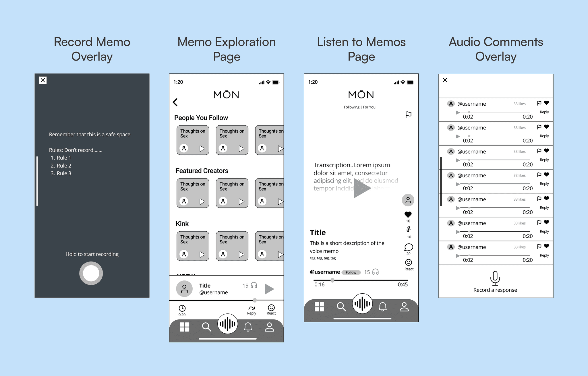
Ideation consisted of two sessions of sketching, in which we selected the best ideas from the team. As interaction design lead I was able to make major contributions to this part of the process by suggesting, what became, the main style of functionality for memos. We gained clear direction for how users would be able to post and interact with memos. We decided to implement a full screen swipe-to-scroll format popular among major social media platforms, but elaborated on common patterns in the design of MŌN memo’s comments and replies. Here, users would be to reply the original post with short fifteen-second audio comments and thread series of additional audio clips off individual comments. The functionality blends patterns established on TikTok and Reddit.
Mid-fidelity memo wireframes
2 home page designs for navigation and content layout
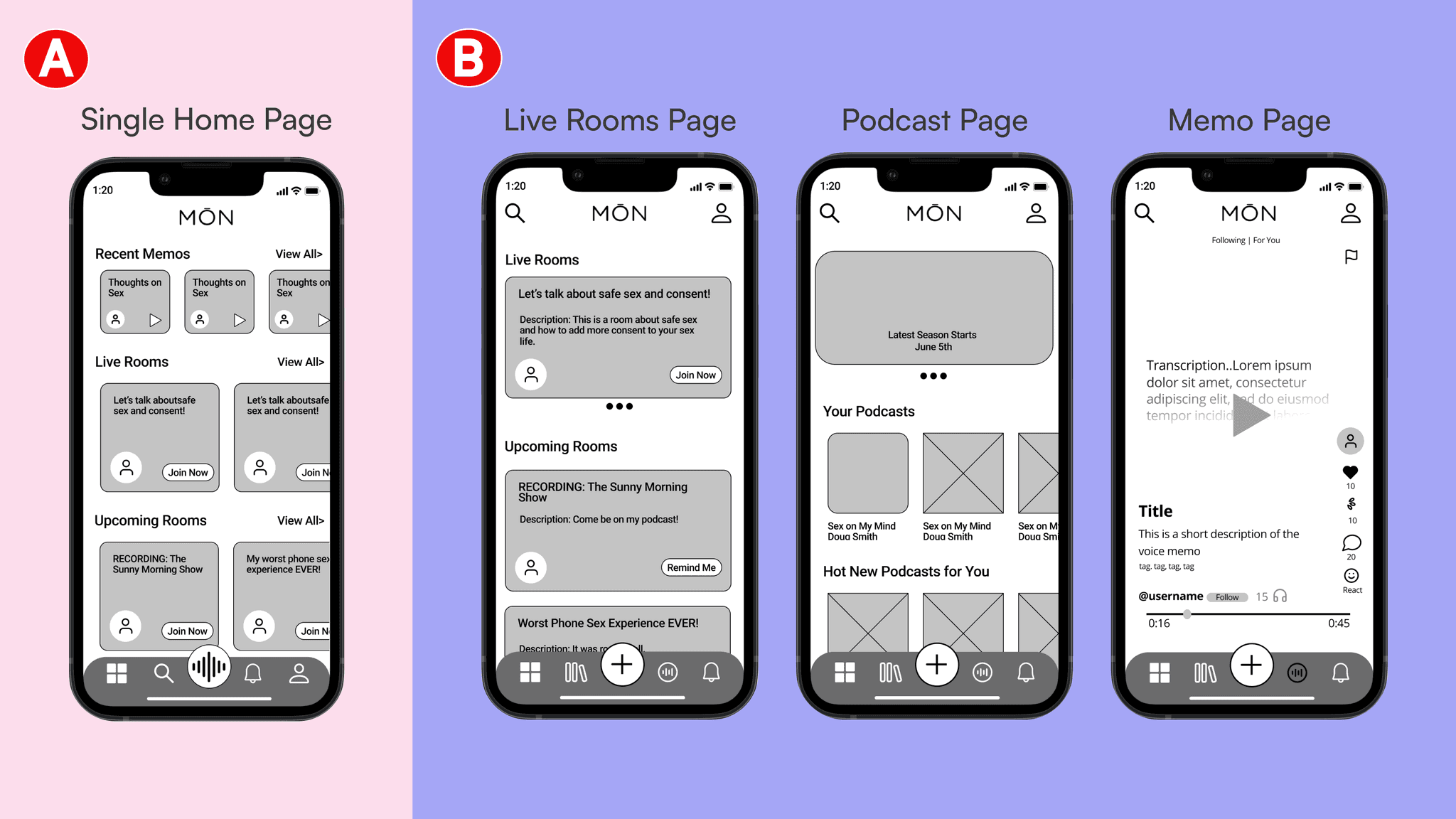
Version A - The single homepage design incorporates the following:
1. Redesign of MŌN’s current homepage design, which builds on MŌN’s design work.
2. Horizontal carousels for memos, live rooms, upcoming rooms, and podcasts.
3. A primary navigation bar that leads to pages whose functions’ are secondary to the apps major content.
Version B - The multi-page content design incorporates the following:
1. Uniquely designed pages for each kind of content- live rooms, memos, and podcasts.
2. A primary navigation bar takes you to each of these pages and your notifications.
3. Non-content functions have been moved to top navigation, and added to the profile page.
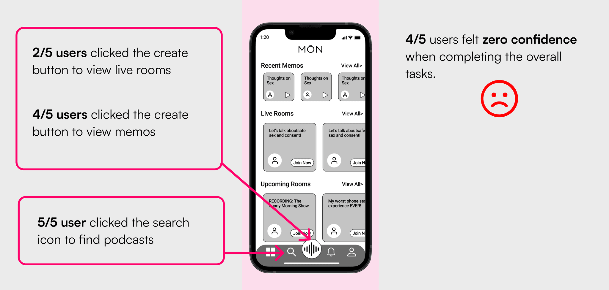
A/B Testing for Homepage (Mid-Fi)
We conducted our A/B tests through Maze, a remote usability testing tool, by creating two separate prototypes and giving users similar series of tasks to complete in each test. There was no crossover, all participants only took the A or the B test.
Single-page home experience test results
Multi-page page home experience test results
Hi-fi design: color
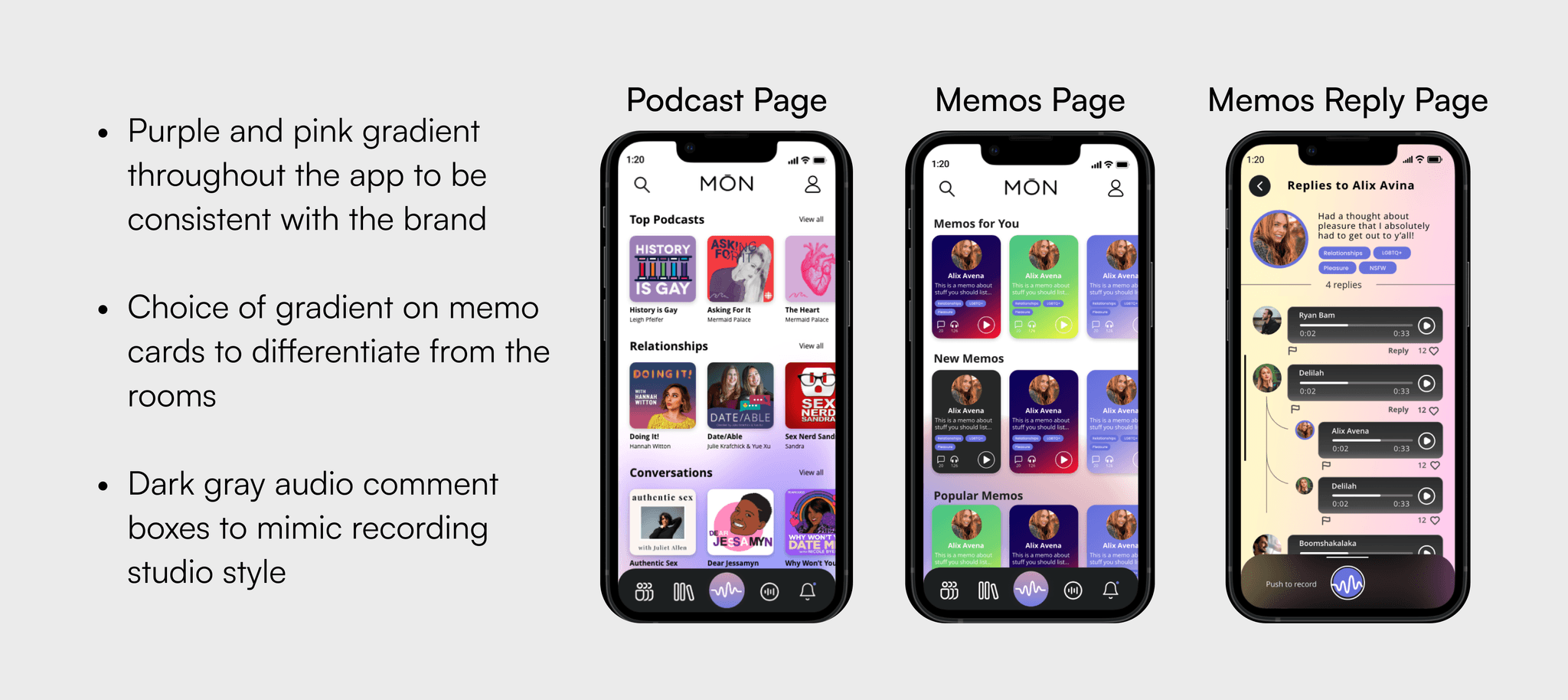
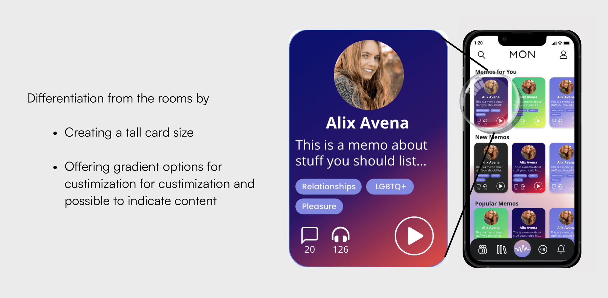
Memo cards
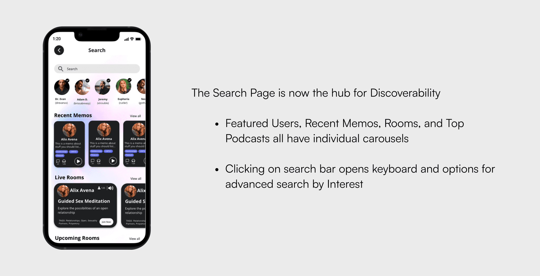
Search page
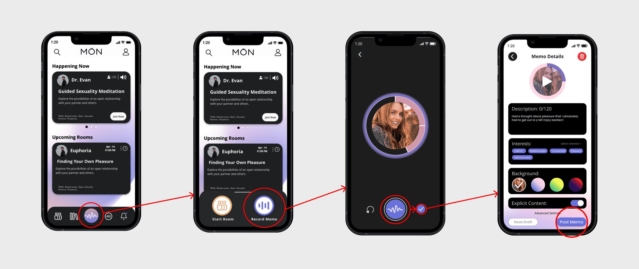
Interaction flow - record and post a memo
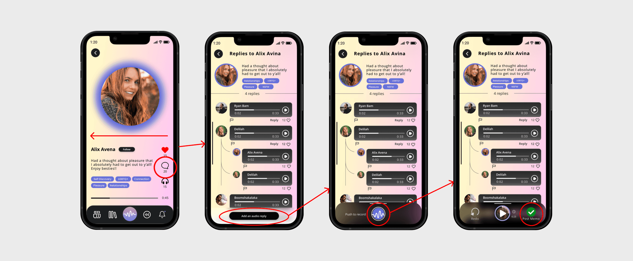
Interaction flow - record and post a memo comment or reply
Final round of usability testing via Maze
We conducted a second round of usability testing on our high fidelity prototype with actual MŌN users. Unfortunately this took longer than expected and we did not have time to test revisions made based on this round of testing. Although the results were overall favorable. We passed on a few revisions to MŌN’s CEO as suggested next steps which we did not have time to back up with a third round testing.
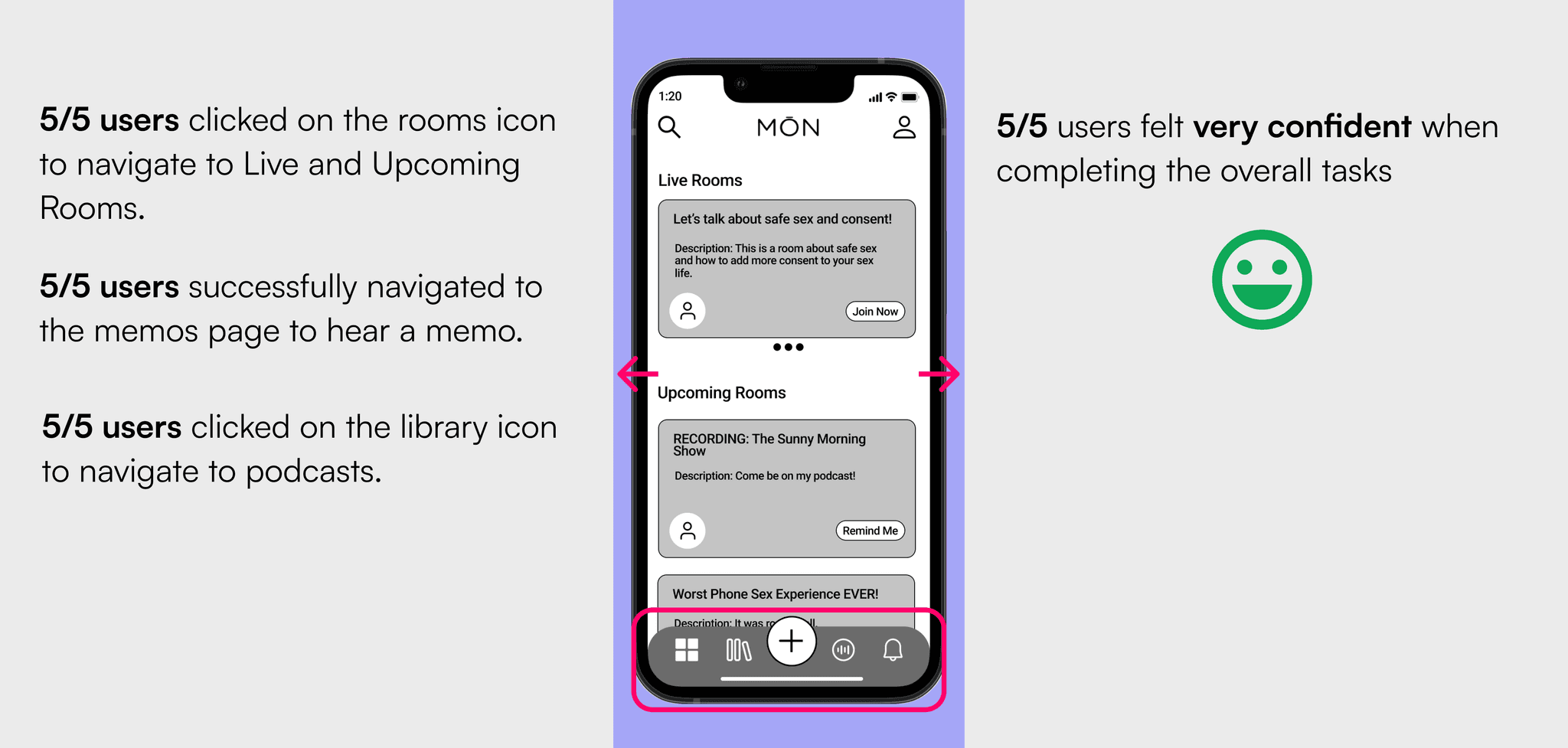
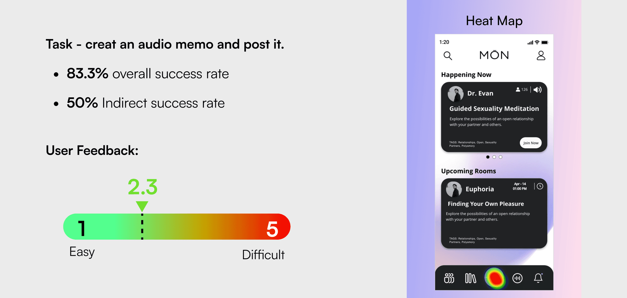
Usability Task 1
Usability Task 2
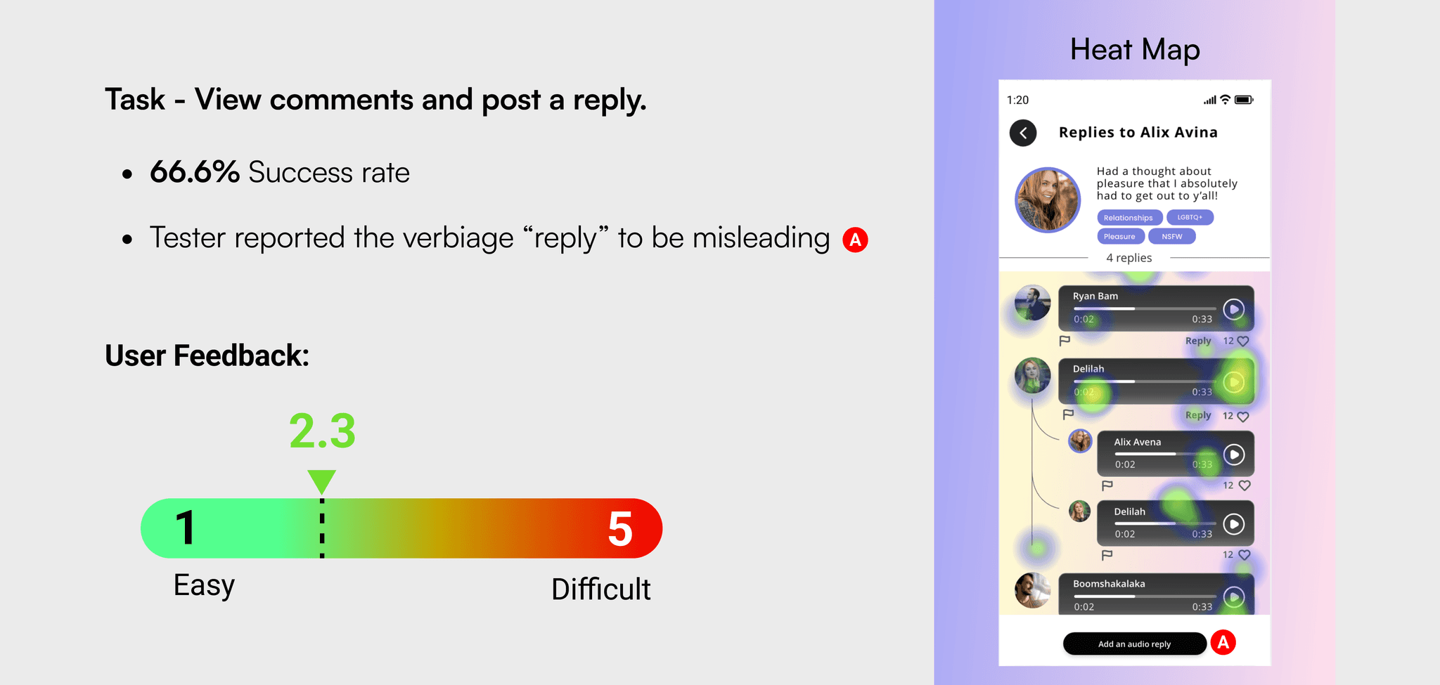
The results of usability task two were considered passable, but less than optimal. The team was confidant in shipping this design provided it was paired with suggested revisions as next steps. We felt it would be wise to improve the call to action on the memo comments page. We sent a few possible redesigns, which will be discussed below. As mentioned before, these revisions were not implemented because there was not time to properly test them.
Additional tasks were included in the usability test but are not included in this case study.
Final Iteration
Next steps
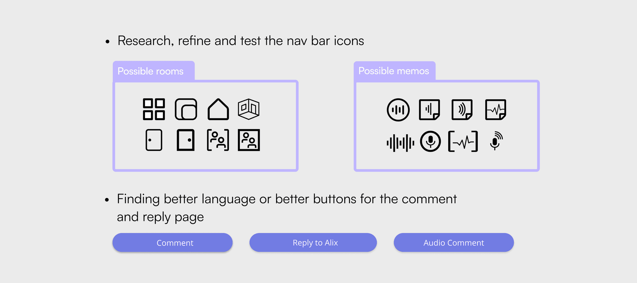
As mentioned previously, the time restraints of this project did not allow for all aspects of the design to be tested as throughly as we felt necessary. Bellow are some possible navigation icons we included with our designs to be tested. As well as, possible call to action buttons that could be tested for the memo comments page.
Recommendations for further testing
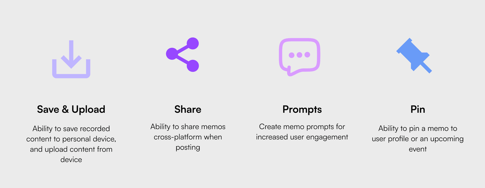
Being that MŌN is currently a MVP, my team was asked to design the memos feature as an MVP as well. We did not include solutions to some of the problems we found in our research. Based on our research, we recommended including the following features to meet user needs and wants when possible.
Future considerations
Personal Takeaways and Lessons learned
I was really excited to work on this project for numerous reason. Social audio apps like Clubhouse and Beams are growing in popularity right now. I personally find them interesting because theres opportunity explore cultural impact and influence in this new area of social media and theres opportunity for users to be creative in new ways with the limitations of audio only content. Additionally, I was more than thrilled to work with a company that pushing the limits of social constructs in numerous areas including freedom of speech on the internet, internet sex work, and most of all society’s general comfort level around discussing sex in positive and healthy ways. There were lots of opportunities to consider things like “what does consent look like in this situation,” “how can we keep or users safe,” and “how can we give users the tools they need to express themselves.” This was more than your run-of-the-mill bootcamp project, no disrespect to anyone.
All that being said this was a huge learning experience for me. Working on FosterRoster I worked with a specific client, but it was casual. We interacted with MŌN as a formal client. We scheduled meetings, prepared agendas, conducted a discovery session, signed a non-disclosure agreement, created and upheld a scope of work and schedule, planed research interactions with actual users, fielded stakeholder questions and concerns, educated stakeholders about the UX process, listened to and weighed-in stakeholder push back while advocating for users, and in the end handed-over agreed upon design files and deliverables.
Thanks for sticking with me this far! I realize this one’s on the longer side. If you’d like to discuss this or anything else in more detail, I encourage you to reach out to me. My info can be found below.